
The Temptation of Dual-Axis Charts
Sometimes when we are trying to show relationships over time between two dimensions of the same metric, or two separate metrics, we run into a situation where differences in the scales involved make it difficult/impossible to really tell what is going on using a standard line chart. One solution we may be tempted to turn to: a dual-y-axis chart, with an axis on the left for the scale that fits one dimension or metric, and a separate scale on the right that fits the other dimension or metric.
Tempting, but risky. This post walks through a couple of scenarios and demonstrates why due care and attention is needed to avoid pitfalls of dual-axis charts. I will follow-up with a post that highlights some alternatives for consideration, instead of giving in to the dual-axis temptation.
The Trap of Dual-Axis Charts
The general idea here is that dual-axis charts should be avoided if possible, because they suffer from at least two flaws:
- Misrepresentation due to mixed scales: changing relative scales arbitrarily can suggest different conclusions and imply relationships that may not be as strong (or weak) as they appear.
- Difficultly in interpretation: these charts require extra mental effort to untangle the lines and associate them with their respective data points.
What the Experts Say: Avoid
Data visualization experts generally recommend against the use of dual-axis charts, for similar reasons cited above (and sometimes more). For example, in the book ‘Better Data Visualizations’* by Jonathan Schwabish, he has a section called ‘Avoid Dual-Axis Line Charts’ that covers similar territory to what is discussed here.
( affiliate link for a book I wholeheartedly recommend for any data viz professional)*
With that baseline-setting, let’s dig into some scenarios and examples to make the point more clearly. As usual, the examples here are produced using R, with ggplot2 package as the preferred visualization tool.
Two common scenarios for dual-axis charts
There are two common scenarios where dual-axis charts become tempting:
- Comparing trends in two data sets that have vastly different scales.
- Comparing a volume metric with a related rate or ratio metric. (so, again, vastly different scales)
Most charting tools allow for the creation of dual-axis charts. Most relevant for our purposes, this can be done in ggplot2:
Scenario 1: Compare trends in similar metrics from two datasets
Suppose we are interested in crypto currencies and are curious about how a crypto currency like Cardano, with its token ADA compares against Bitcoin (BTC).
As always, the visualization choice should be based on what questions we are trying to answer, what we are hoping to learn, and, ultimately what decisions we want to make.
If we don’t have a specific objective beyond curiousity and want to start with general exploration, we still need to frame up our exploration. Our first thought may be to compare prices over a recent period, to answer questions like:
- What are the relative changes in the currencies over time?
- Do the two follow a similar pattern of ups and downs?
- Are there any points where a general pattern breaks? (could provide focus for further investigation)
- Eventually: are there ways we can take advantage of these patterns to make investment decisions? (probably beyond initial scope but helps to have that broader perspective)
So we gather some price data (Cdn$). Here is a random sample of rows, along with summary data. We can see the two sets of prices are on much different scales.
| date | BTC_CAD | ADA_CAD |
|---|---|---|
| 2021-01-10 | 48818 | 0.388 |
| 2021-04-03 | 72437 | 1.475 |
| 2021-04-17 | 75906 | 1.732 |
| 2021-04-27 | 68280 | 1.622 |
| 2021-06-20 | 44447 | 1.779 |
| 2021-09-07 | 59200 | 3.165 |
Basic line chart
This is confirmed in a basic line chart produced in ggplot2: (click into code block and scroll/drag horizontally)
crypto_data %>% ggplot(aes(x=date))+geom_line(aes(y=BTC_CAD), color='gold')+
  geom_line(aes(y=ADA_CAD), color='blue')

This shows us the pattern in Bitcoin prices but due to difference in scales, doesn’t help much with any of our questions around comparing patterns between the two currencies.
Dual-axis option
A common approach, then, is to use dual y-axis, with different scales on each, to enable visibility of the data side by side. This can be a trap if not managed carefully, though. There are two key questions to ask:
1. what should the range of the second axis be?
2. How to make it as easy as possible for user to interpret, without having to wrap their heads around lining up different data with different axes.
Depending on your tool of choice, you may have a variety of options. For example, default two-axis chart in Google Sheets looks like this:

It takes a bit to get oriented and in this case depends on your knowledge that BTC has much higher prices, so must be the left axis, and ADA is on the right axis. (this could be handled with better axis labelling)
The thing I notice here is that once I get settled that the blue line is Bitcoin, I can easily line up the start against 40,000 or so and as I follow the trend over time and get near the end, my eye gravitates toward the closer axis on the right – just under 3. Then I realize that doesn’t make sense and I switch back to the left axis for reference. So my brain is spinning a bit. Similarly with the red ADA line, where my tendency at the start of the period is to associate it with the left axis, then adjusting to look all the way over to the right axis and continue from there.
Once we get through that, the dual-axis does provide a way to view the two data sets alongside each other with much more granularity than the previous chart. In terms of the patterns we are looking to discover, it shows a relatively close relationship in trends and some points, divergence at others. Both have trended up over time. Maybe Cardano is more volatile, prone to relatively higher peaks and lower troughs?
Before we go too far with our conclusions, though, there are some further subtleties that we should be aware of.
Relative Scales Matter
The above Google sheets chart is based on an automatically-selected ratio of 25000:1 in the two axes. This automatic selection may be suitable in some cases, but not necessarily all.
In R, ggplot2 includes the option to add a secondary y-axis and set the transformation from the left axis to the right axis. This provides flexibility, but also comes with a caution:
- the choice of relative scales can spin the interpretation of the data in different ways, as shown in the examples below: (based on 4 charts built with the code shown below but different transformation values)
## select a relevant transformation factor
transfm <- 5000
col_left <- 'darkgoldenrod3'
col_right <- 'blue'

ch_title <- paste0('BTC vs ADA (scale ratio: ', transfm,')')
cd1 <- crypto_data %>% ggplot(aes(x=date)) +
  geom_line(aes(y=BTC_CAD), color=col_left)+
  geom_line(aes(y=ADA_CAD*transfm), color=col_right)+
  # Custom the Y scales:
  scale_y_continuous(
    # Features of the first axis
    name = "BTC",
    # Add a second axis and specify its features
    sec.axis = sec_axis(~./transfm, name="ADA")
  )+labs(title=ch_title, x="")
grid.arrange(cd1, cd2, cd3, cd4, nrow=2)

Note: GOLD line = Bitcoin, BLUE line = ADA. The charts are simplified for this demo; in a more formal presentation, the data-axis match would be made more clear on the charts themselves.
In terms of relative scales, the smaller the ratio used, the more the secondary axis is stretched out. The result:
- top-left: the lowest ratio used (5000:1) compresses the ADA (blue) line, revealing some patterns but suggesting it is relatively stable compared to BTC (gold) line.
- cycling through a few variations shows the impact of various relative scales.
- lower-left: 25000:1 ratio as the Google sheets example.
- lower-right: by the time we get here, we have flipped the story to where ADA (blue) looks like the volatile one, soaring to great heights and then crashing back down, while BTC (gold) is relatively quiet.
I’m not sure there is a clear/correct/easy answer here. It is just a hazard that comes with these charts, something to watch out for when data is presented this way, and a reason to be wary of using dual-axis charts.
The bottom line is that the answers to our questions may vary with the ratio between the two scales, may lead us to different conclusions, may cause us to take or recommend different actions depending on which view we are looking at, even though it is the same data.
Ratio by Calculation
As far as finding a fair/reasonable transformation value, one way to go about it may be to calculate an overall ratio of the two datasets. For example, rather than picking a number:
transfm <- median(crypto_data$BTC_CAD)/median(crypto_data$ADA_CAD)
Median BTC vs ADA is 34242.71 so this could be useful for transformation, at least as starting point. You could 1) use this directly, as below, or 2) use it to guide you toward a nearby number that is a nice, round number to work with. For example, a reasonably close multiple in this case is 10,000 (chart in the top-right of the 4 charts above). This is much easier for a person to relate to when comparing the two axes, making it slightly less daunting.
ch_title <- paste0('BTC vs ADA (scale ratio: ', transfm,')')
crypto_data %>% ggplot(aes(x=date)) +
  geom_line(aes(y=BTC_CAD), color=col_left)+
  geom_line(aes(y=ADA_CAD*transfm), color=col_right)+
  annotate("text", x=date('2021-02-20'), y=75000, label='BTC', color='goldenrod', size=6)+
  annotate('text', x=date('2021-05-26'), y=100000, label='ADA', color='blue', size=6)+
  # Customize the Y scales:
  scale_y_continuous(
    labels=dollar_format(),
    # Features of the first axis
    name = "BTC",
    # Add a second axis and specify its features
    sec.axis = sec_axis(~./transfm, name="ADA")
  )+labs(title=ch_title, x="")

Conclusion – Scenario 1
The takeaway for me here is confirmation of the ‘best practice’ warnings to avoid the tempatation of dual-axis charts: both because of how the story in the data can be manipulated and for the mental gymnastics required to parse out what that story is.
Let’s see if this conclusion holds up for another scenario…
Scenario 2: Comparing a Count and a Ratio
In other cases, we may want to compare patterns in a volume or count metric with a related key indicator. Here’s an example using some Google Analytics data for a website:
- daily users
- daily conversion rate
Interesting questions with these metrics can include:
- what is the relationship between patterns in site traffic and conversion rates?
- do increases in daily users correspond to decreases in conversion rates or vice versa?
- are there any points where breaking of the typical relationship between these metrics warrants further investigation?
Quick look at the data:
| date | users | conv_rate |
|---|---|---|
| 2021-11-13 | 538502 | 0.026 |
| 2021-11-14 | 483116 | 0.019 |
| 2021-11-15 | 465402 | 0.018 |
| 2021-11-30 | 448335 | 0.015 |
| 2021-12-02 | 541645 | 0.012 |
| 2021-12-03 | 482156 | 0.013 |
Again, very different scales – no surprise there.
Dual-axis Lines
transfm <- median(ga_data$users)/median(ga_data$conv_rate)

col_left <- 'blue'
col_right <- 'purple'

ch_title <- "Website users vs conversation rates"
ch_sub <- paste0("(Ratio: ",transfm,")")
ga_data %>% ggplot(aes(x=date)) +
  geom_line(aes(y=users), color=col_left)+
  geom_line(aes(y=conv_rate*transfm), color=col_right)+
  # Custom the Y scales:
  scale_y_continuous(
    # Features of the first axis
    name = "users", labels=comma,
    # Add a second axis and specify its features
    sec.axis = sec_axis(~./transfm, name="conversion %", labels=percent)
  )+labs(title=ch_title, subtitle=ch_sub, x="")+
  theme(axis.text.y.left = element_text(color=col_left, size=8),
        axis.title.y.left = element_text(color=col_left, size=12),
        axis.text.y.right = element_text(color=col_right, size=8),
        axis.title.y.right = element_text(color=col_right, size=12))

Looks pretty messy but there does seem to be some degree of opposite movement in these two metrics. There is also the precipitous drop in conversion rate at the start of the period that is probably worth looking into, especially since there is little change in volume of users at that point.
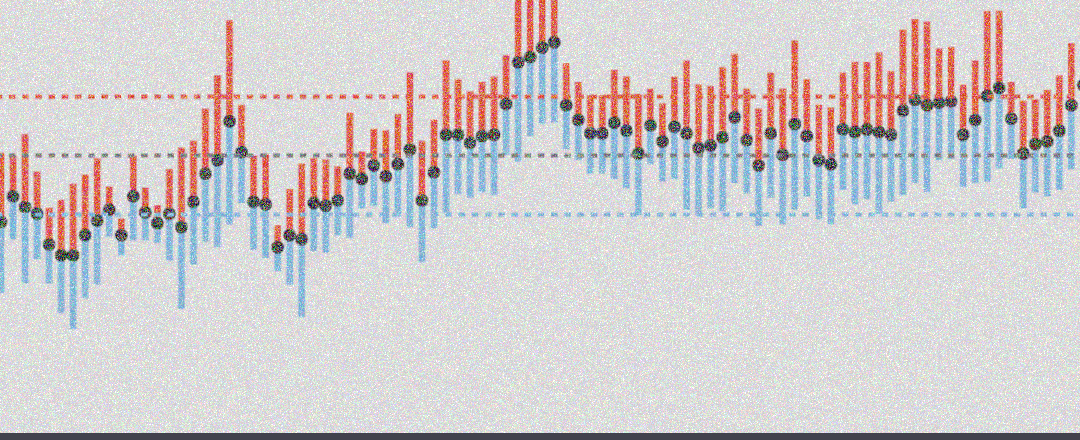
Dual-axis with Bar Chart
When working with two different types of metrics, a variation on the line charts that can help to bring out the message within the data is to combine bar chart and line chart.
- bar chart to represent count or volume metrics
- line chart for ratio or rate metrics
In the example below, I have changed the transformation ratio from the median calculation (~26 million) to 10 million. This maybe provides a more intuitive way to interpret the relationship: it is easy to see that when the scale doubles on one side, the other scale doubles as well.
transfm <- median(ga_data$users)/median(ga_data$conv_rate)
transfm <- 10000000
col_left <- '#009E73'
col_right <- 'darkblue'

ch_title <- "Website Users vs Conversion Rates"
ga_data %>% ggplot(aes(x=date)) +
  ## change line to bar chart for contrast
  geom_col(aes(y=users), fill=col_left)+
  geom_line(aes(y=conv_rate*transfm), color=col_right, size=1)+
  # Custom the Y scales:
  scale_y_continuous(
    # Features of the first axis
    name = "users", labels=comma,
    # Add a second axis and specify its features
    sec.axis = sec_axis(~./transfm, name="conversion %", labels=percent)
  )+labs(title=ch_title, x="")+
  theme(axis.text.y.left = element_text(color=col_left, size=10),
        axis.title.y.left = element_text(color=col_left, size=14),
        axis.text.y.right = element_text(color=col_right, size=10),
        axis.title.y.right = element_text(color=col_right, size=14))

It does seem somewhat easier to untangle the relationship using the bar and line combination, along with the even 10M:1 ratio. From this view, it looks like there is no consistent pattern in the trends between the two metrics, with conversion rate sometimes rising with user count increases, sometimes dropping. So that provides us with some answers to our initial questions about the relationship.
We are still left with the same challenge, initially at least, of wrapping our heads around what is going on here, which axis is which, what the relative values are.
Conclusion – Scenario 2
This second scenario confirms that even for a different use case, dual-axis charts are problematic. The competing scales are an issue and switch to a combo of bar and line may help, but doesn’t remove all the problems.
Tips
As the above examples highlight, if you are unable to resist the temptation to display your data in a dual-axis chart there are some things to do in order to make it as easy as possible for users to extract meaning:
- make sure both axes are carefully and clearly labelled, with color or other signals to associate the axis to the respective data.
- consider mixing bars (vol) and lines (ratios), although don’t rely on this to solve the major problems.
- be responsible: don’t contort scales to fit your pre-defined message or beliefs or hopes or other biases.
- make second axis a factor of 10 ratio if feasible, since it is easy for people to translate between the two scales.
- for full transparency, disclose the ratio between the two scales that is being used.
Alternatives to the Double-Axis
On the other hand, if we are to resist the temptation to dual-axis charts, what are the alternatives? I’ll share my thoughts – and examples – in the next blog post.
